Welcome

Welcome to my blog. Here you will find research and planning, construction evidence and evaluation for my AS foundation portfolio.

Friday, 30 March 2012

Evaluation Question Six

The image above is an image of me working on my product and also working on my blog. We used Apple Mac computers to do this work. On the Apple Macs, the main two softwares we used to produce this magazine was:


Adobe Photoshop 

and InDesign
I produced my front cover on Photoshop and I used InDesign for my contents page and double page spread. However for the final product I put my front cover into InDesign so it was easier to print off.

I also used other products for example Prezi.com was used in my planning so i was easier for me to make planning notes and show my research. I also used slideshare.net which helped me convert a powerpoint and enter it onto blogger.com which is where I have put all my notes that I have made and also to show progress I have made during the production of my magazine. Also in my evaluation I used Final Cut Pro and pixton.com to produce some of the evaluation answers.


I also used the studio to do my photoshoots in and above are images of me using the camera in the studio to take photos of my models for my magazine.

Tuesday, 27 March 2012

Evaluation Question Five

For my primary research I wrote a list of different stylistic ideas I want in my product to appeal well to my target audience. Below is a list of stylistic decisions I'll make for my project following my audience feedback:
  • The cover should make people want to read the magazine and this could be done with intriguing sell lines or an interesting/eye catching model.
  • My mast head should look more interesting and not plain like the one for 'Q' because most people found that plain was boring.
  • Somehow link the contents page to the front cover, for example, by putting a smaller version of the mast head in the corner of the page or using the same font on the contents page as the cover.
  • Maybe link everything back to the front cover so people know it's the same magazine for example adding a small icon of the mast head in the corner of each page including the contents and double page spread.

The product below is my finished product and I feel I have done majority of things on my list above. The feel I've made the sell lines on my cover quite intriguing as I have used key words like 'exclusive' and 'must see'. My mast head is quite big and eye catching and not really plain and boring like the 'Q' magazine one because it isn't just one letter in a box. I have definitely linked the pages together and given it a more consistent feel because of the fonts and the colour schemes. I have tried to link everything back to the front cover by using the colour scheme and fonts and on my double page spread there is a smaller version of the mast head in the top left hand corner.


I put some rough cuts of my product on my blog and then got feedback from my teachers on what to change. Below are the rough cuts before the feedback:


From the rough cuts the feedback I received was to change the colour scheme on my cover from red, white and black to purple, white and black (so it matches my model's skirt) but this meant the colour scheme for the whole magazine needed to be changed. I know purple is quite a feminine colour but it still appeals to most men too which is good because my target audience is both male and female. Also I was told to change the font of the mast head because it was too feminine. Although my target audience is predominantly female (60% - 40%) there will still be some males reading it so I changed it to a neutral font that appealed to both genders. 

I showed my final product to my peers and got some feedback on who they thought the target audience might be:


The questions I asked my peers were:
What draws your attention to the product?
What genre is it and how do you know?
What do you consider are the strengths of the product?
What social groups does it represent and how?
Would you purchase the product and why?
How would you improve the product?

Like it? Create your own at GoAnimate.com. It's free and fun!

Monday, 26 March 2012

Evaluation Question Four

Who would be the audience for your media product?


I feel my product would attract an audience of 16 - 25 year olds. These 16 - 25 year olds would be in middle classes and they would enjoy what most 16 -25 year olds enjoy like going out and having a good time with their friends, high street clothing, mainstream music like R&B and social networking sites etc.

Friday, 23 March 2012

Evaluation Question Three


The comic above shows the four main steps to producing a magazine. 


The magazine distributor I think would distribute my magazine is Bauer Media. This is because they already distribute and publish three other music magazines but those magazines are a similar genre to each other and having a music magazine of a different genre like mine which is R&B, it could help them gain a different audience. My magazine could get Bauer Media a new audience of townies and mainstream teens and young adults. 


Because my audience is mainstream, advertising should be easy. Social networking sites such as Facebook and Twitter are very mainstream and very popular with the age group and the sort of people my magazine will attract therefore advertising on popular social networkings sites would definitely attract an audience.


As our generations and future generations are being brought up constantly using the internet, advertising as well as distribution needs to be put online. The magazine could be bought in a shop online instead of going out and buying them in a shop however I am not saying that they should not be distributed in shops as well. Most magazines these days have subscriptions online where once you subscribe, you get the new issue posted to your house instead of going out and buying it and I think this is the way I would like my magazine to be distributed too.

Thursday, 22 March 2012

Evaluation Question Two


The video above is how I represent social groups in my media product

Friday, 16 March 2012

Thursday, 15 March 2012

Rough Cut Improvements - Double Page Spread


I have changed the background for this page to make it more edgy and give it a little something extra. 

Rough Cut Improvements - Contents Page


The font I original chose has changed and this one makes the magazine look more professional as it matches the font used on the front page and the variety of fonts used on this page is good because it isn't plain with the same font used all the time.

Tuesday, 13 March 2012

Rough Cut Improvements - Front Cover

Front Cover


The image above is my improved front cover. I have changed the font and the layout because before it did not look professional at all. The image and the badge however have stayed the same and also I had to change the colour scheme for the cover so it matched the image more which then meant the colour scheme for the whole magazine (contents and DPS) also had to change. The colour came from the skirt my model is wearing and to get the colour I used the eyedropper tool which allows you to click anywhere on the page and it will get that colour that you have clicked. The sell lines have been adjusted so they do not all look the same. I did this by stretching certain words to fit the space around the image. The font is still the same however because of the different sizes it makes the page look more interesting. 

Friday, 9 March 2012

Rough Cuts


This is my front cover, contents page and double page spread so far. For feedback that I got off my teacher, she said that my front page needs a bit of work. I need to change the colour of my mast head to purple that way it matches the skirt my model is wearing. This may also mean I have to change the colour scheme for all the other pages to purple, black and white instead of red, black and white. She also said that for my double page spread, I need to make it different and I could do this by having it as a black page with white writing.

Thursday, 8 March 2012

DPS construction

 
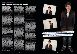
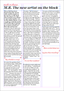
On one side of my double page spread I am going to have my article. Images of the artist the article is about will go on the other page. After transferring the text I wrote on my blog into the actual columns, I realised it did not fit the full page. So to add to it, I wrote a small paragraph advertising the Sizzle website and all the different features it has so that the reader will go on the website and find out more juicy gossip or exclusive interviews our magazine has done.


For the other side of my double page spread, I wanted to have writing going across the main image which is central at the moment however I want to add little images on the side  and I do not think there is enough room at the moment so I may have to move the image to the right side and then have my little images on the other side of the page.

This is my finished double page spread so far.

Contents Construction


This is my contents page so far. It is pretty much done however I am going to add an image in the background of one of my models however the image background is dark so I may have to adjust the colours a bit.
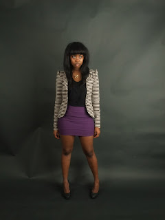
The following images are of my original contents page model, Monde. For my contents page, I wanted a full body shot of my model in the centre of the page and then have the different information about what to find in the magazine surrounding the image.


Model: Monde Dimuna


 However I felt a picture of my original front cover model, Anna, would fit this page more. So I used the image below which was from my front cover photo shoot with her.


Tuesday, 6 March 2012

Front cover construction


This was my cover before I added my image. I tried to make my main sell lines bigger than the rest which is what most magazines do however the first sell line about the Top 5 Singles is a bit too big as it does not match the other sell line sizes. This must be changed in case people mistake it for the main sell line. My main sell line will relate to my image as this is how it is for most magazines. The colour scheme is red, black and white with the occasional orange.


Model: Anna Dorabant


For my front cover, I was going to use my model Anna on the cover however none of the pictures of her fit with my text. The text was always overlapping her and it looked odd when I changed the text around. This is because I needed to images to be more one sided however I did not realise this when I was taking the pictures. I also forgot that my front cover image could not be landscape and had to be portrait. So I decided to go with another model and use one of the images of Anna for my contents page. The use of a female model on my cover goes with my target audience as I want it to be predominately female (60% females, 40% males) 


Model: Monde Dimuna


The model above was originally meant to be on my contents page however because of the situation with my other model Anna, I took some pictures of her as a front page model baring in mind all the details I forgot when shooting Anna like knowing where my text is on my front page and not having her central in my image.


These are the two images I had to chose as a front cover image. I tried the first one however the mast head was covering half of the top of my models face and it would not work behind the image as people would not be able to tell what magazine it was. So I chose the second image, which worked well because there was enough room above her head for the mast head and the skyline/banner. 


Thursday, 1 March 2012

Photoshoot images


The images above were originally meant to be for my contents page however during the photoshoot I tried to take some as front cover images by having my model less central and more to the right. I like the differences in my models poses as she has a fierce facial expression in the first few pictures however her face softens up later so I had a nice difference in the types of images to put as a cover image.


The images above are the images I originally thought I would use as front cover images however my model's costume is not as strong as it could be for an R&B artist so I decided to use my other model for my front cover. This model I felt would look better on my contents page. At first I wanted my contents page image to be a full body shot however a medium shot worked just as well so I took some medium shots of her in the centre of the frame so I could have my contents page information surrounding her.


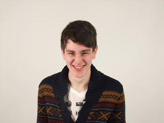
The images above are the ones I took for my double page spread. My model is supposed to be portraying a young fresh R&B artist who is a slightly cheeky and quite fun. This is how I wanted my pictures to come across. I had one portrait full body shot to go on as my main image on one side of the double page spread and then I took smaller landscape medium shots to put on the side as little side images